
Overview
When creating your experiences you can utilize a content group to dynamically populate a grid component. You have two grid types:
- Grid – No Child: Useful for listing items (brands, features etc), but don’t require an additional more detailed page per item.
- Grid – With Child: useful when each item needs its own detailed page. A “child-page” will nest beneath the “parent-page” in your project’s structure. This “child-page” will be a templated page, so when an item is selected in the carousel, the contents of that item dynamically populates into the template. This allows you to easily create consistent, item-specific detail pages automatically.
Note: Grids are not automatically updated with new items that are added to a content group, this ensures that only items that are ready are visible to end users. Please see – “Updating a Content Group for Use in a Dynamic Carousel or Grid”
Creating a Grid — No Child
- Create a content group if you don’t already have one.
→ See “Creating a New Content Group” for detailed steps. - Navigate to “Sections” and either select an existing section or create a new one.
- Create a new page by clicking the “+” icon on the left-hand navigation bar.
- In the “Component Settings”, select the “Grid” page component, then choose “No child”.
- A new tab called “Dynamic Content” will appear above the component list. Select this tab.
- Under “Content Group Items”, choose the content group you want to use from the drop-down menu.
- Select the relevant items or checkboxes. You can select specific items within the content group or click the top checkbox to select all items.
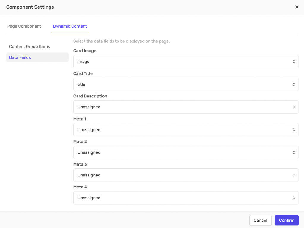
- Go to “Data Fields” and assign the data fields you want to display.
Data fields are defined when creating a content group and control what appears on each card — such as the image, title, description, and any metadata you’ve applied. - Click “Confirm” to populate the grid on the page.
- Rename the page as needed to keep your structure clear and organized.
Note: Grids are not automatically updated with new items that are added to a content group, this ensures that only items that are ready are visible to end users. Please see – Updating a Content Group for Use in a Dynamic Carousel or Grid
Creating a Grid — With Child
A. Creating the Grid and Populating the Parent-Page
- Create a content group if you don’t already have one.
→ See “Creating a New Content Group” for detailed steps. - Navigate to “Sections” and either select an existing section or create a new one.
- Create a new page by clicking the “+” icon on the left-hand navigation bar.
- In the “Component Settings”, select the “Grid” page component, then choose “With child” to enable a nested (parent–child) page structure.
- A new tab called “Dynamic Content” will appear above the component list. Select this tab.
- Under “Content Group Items”, choose the content group you want to use from the drop-down menu.
- Select the relevant items or checkboxes. You can select specific items within the content group or click the top checkbox to select all items.
- Go to “Data Fields” and assign the data fields you want to display. Data fields are defined when creating a content group and control what appears on each card — such as the image, title, description, and any metadata you’ve applied.
- Click “Confirm” to populate the grid on the parent page.
Note: Grids are not automatically updated with new items that are added to a content group, this ensures that only items that are ready are visible to end users. Please see – Updating a Content Group for Use in a Dynamic Carousel or Grid
B. Populating the Child-Page
- In the left-hand navigation, select the newly created child page (nested under the parent page). Click “Insert block” in the middle of the page, choose the block layout you want and click “Add”.
- Set up the new block to display your content:
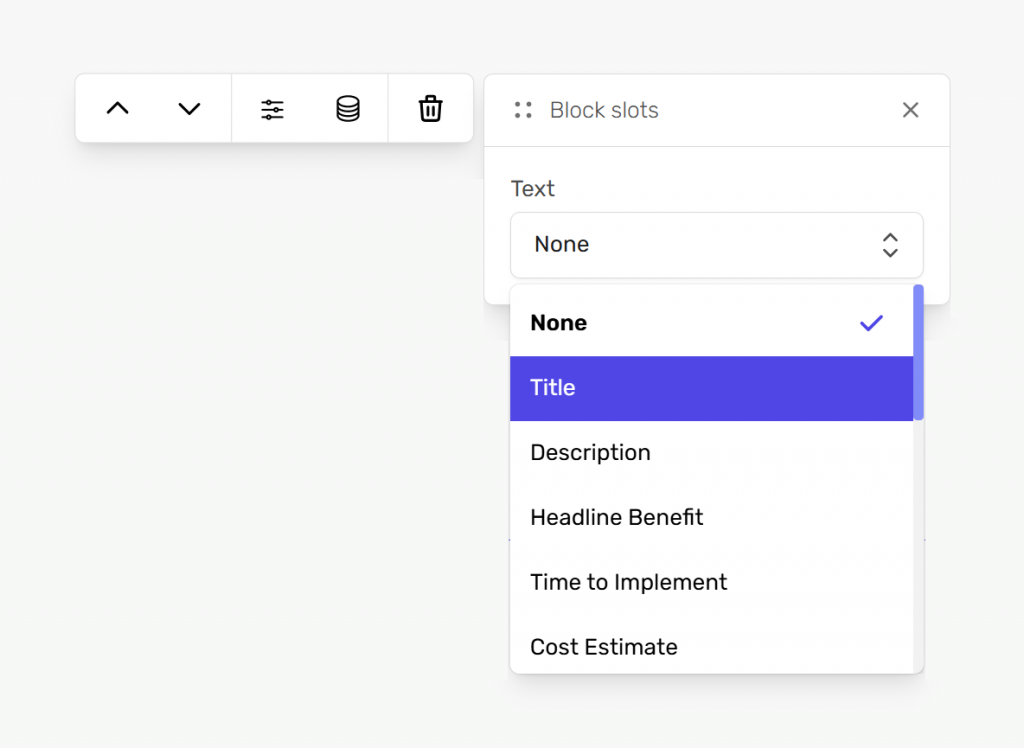
- Select the new block.
- In the toolbar above the block’s top-left corner, click “block”.
- Click the “Attach content” button in the toolbar above the block.
- From the “Media Grid” drop-down menu, select your desired content group field.
The block will now dynamically display your chosen content.
- Rename pages as needed to keep your structure clear and organized.
C. Preview Content on the Child-Page
To preview your different content items within your child-page, navigate to the “Page Settings” on the right-hand side, locate the “Preview content item” drop-down menu, and select the content item you wish to preview.
Grid Card Data Fields Summary

Each card in your grid displays information pulled from “Data Fields” linked to your content group. These fields define what appears on the card — for example, the image, title, description, or metadata. If a field is left “Unassigned”, that element won’t be shown on the card.
Attaching Content Within a Block
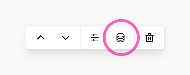
To display your content within a block, select the block, click “BLOCK” on the navigation bar that appears above or below the block, click the “Attach content” button highlighted below, and choose a “Content Group Field” from the drop-down menu.
The type of content group fields available will be based on what type of block it is – like text for a text block or an image for a media grid. These fields are established when you create your content group. The block will automatically populate with the corresponding dynamic content from your selected content group.