The following information applies to these components

Within a “Block Page”, blocks are used to display content such as assets and text.
Insert a Block
To insert a block, either click on the “Insert Block” button to insert your first block, or click on the plus button at the bottom of a column.
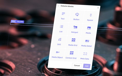
The following blocks are available:
Text
Text is used to display written content. With a number of styling options available when the text is selected.
Button
Buttons are used to create actions and links. There are a number of alignment, size and style options available.
Spacer
Spacer is used to manually add vertical space between items. You can set the exact height of the space.
List
Lists are used to display items in a pre-formatted list. You can choose how many items in the list, as well as a number of styling options.
Hotspot
Hotspot is used to overlay interactive touchpoints over an image. These hotspots have a number of styling and can be used to create actions and links.
Media
Media is used to display a single media item at a time. If you select multiple media items, they will be displayed in a gallery format with next/previous arrows. There are a number of styling and action options available.
SVG
SVG block is used to display a single vector graphic.
Media Grid
Media Grid is used to display a range of media items in a grid format. Each item can be clicked You can insert as many media items as you like, with two styling options.
Media Detail
Media detail is used to display a single media item with additional text to describe the item, alternative thumbnail and view button. There are a number of styling options available.
Media Object
Media detail is used to display a single media item with additional text for title and a description.
Delete a Block
To delete a block, click on the block label. On the pop-up menu, click on the delete button.

Reorganize Blocks
To reorganise blocks, click on the block label. On the pop-up menu, click on the up/down buttons.

Block Settings
To access a block’s settings, click on the block label. On the pop-up menu, click on the edit button.
