Within a theme, under the tab “Buttons & Hotspots” you can control the buttons used within your theme.
As you make changes, a preview is shown on the page. Remember to click “Save” in the top right-hand corner as you work.
Button Types
Within the platform you have two button styles:
- Primary
- Secondary
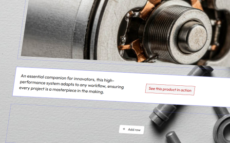
You can set the properties of each button independently.
Button Options
Background Color and Text Color
This is the native color of the button, to set either the background or text color, click on the dropdown menu, and select any color available from your theme colors.
Hover Background Color and Hover Text Color
This is the color of the button when the cursor is over the button, you can simulate this within the button preview pain.
To set either the background or text color, click on the dropdown menu, and select any color available from your theme colors.
Border and Border Color
By selecting “Yes” or “No” you can add a border to your button.
To set the border color, click on the dropdown menu, and select any color available from your theme font colors.
Roundness
This setting allows you the following options for your button:
- Squared – The button corners are square
- Smooth – The button corners have a gentle curve
- Rounded – The button has fully founded corners
Shadow
This setting allows you choose whether the button has a shadow or not, and what the intensity of that shadow should be from Small, Medium, Large and Extra Large.