
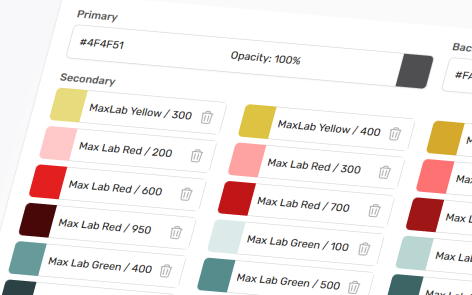
When editing a Theme, under the Colors tab you can control the colors used within your theme.
As you make changes, a preview is shown on the page. Remember to click in the top right-hand corner as you work.
Color Types
There are a number of different color types used on the platform
- Primary — Dictates the default color of many theme elements such as buttons, hotspots, titles and cards. These can all be changed individually in the theme’s respective tab.
- Background — Used as the default background page color.
- Text Color — Used as the default text color excluding titles.
- Text Light Color — Used mostly in email template footer text color, divider color and user block text color defaults.
- Secondary Colors — These are colors that can be set to different theme elements such as buttons and typography, including the ones listed above, and set to individual elements within the section builder.
Utilising Colors in Your Themes
You can designate the colors set in your theme’s Colors tab to other categories in your theme. By default these will be set to Primary, Text, Background, White or other pre-set Secondary colors. You can edit these as you see fit for your Experiences.
Adding New and Editing Colors
To add a new Secondary Color within your theme click the located under your existing Secondary colors. You can have an unlimited number of Secondary colors and newly created ones will default to black.
You can rename colors by clicking on the entry’s name and can delete a color by clicking the on the right-side of an entry.
To edit any color, click on the colored box of the entry, and a window will open with options for Theme or Custom:
Theme
Theme gives you options between all of your theme’s colors: this allows you to set your Primary color as any Secondary color for example. It’s recommended to have all your desired colors available as Secondary colors so you can swap out your Primary, Background and text colors without losing your old swatches.
You can search through this modal by filtering through the colors names, hex codes, RGB values or just the visual swatches.
Custom
Custom opens up a color picker
Within this color picker, you can:
- Use the visual guide to pick any color
- Insert a hex reference (e.g. #9E2A55)
- Insert an RGBA reference (e.g. 158, 42, 85, 1)
A represents the opacity value — 0 means fully transparent, 1 means fully opaque, and values are set in decimal increments (e.g., 0.5 equals 50% transparency).
If you input a specific hex code or RGBA value through the Custom tab, you can press enter to close the color picker window.
If you search through your colors via one of these specific tabs (e.g. Custom or Theme>Name), when you close and reopen this window on the same browser the last selected tab will be remembered.
Predefined Colors
Some navigation elements use predefined theme colors rather than having individual colour settings.
Navigation text and icons (search bar, basket, interactive viewer etc.) use the Theme’s Primary color; and navigation hover color, and the solid color of the page the user is currently on, is set by the Primary button color.