The following information applies to these components

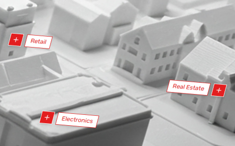
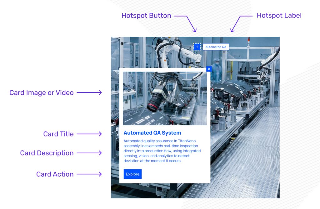
Hotspot and Card Overview
Hotspots and their subsequent cards are structured as such:
Modification Options
- Change the hotspot label text
- Add a link to a hotspot
- View a hotspot card
- Delete a hotspot
- Edit the hotspot settings – including the position.
- Change the card alignment – button and text
Hotspot Label Text
To edit the text that appears on the hotspot label, double click on the label text and this will allow you to start editing the label.
Hotspot Link
To add a link to a hotspot, click on a hotspot, and click on the link button. There are many different options and types of links you can apply to a hotspot.
If a card is enabled, then please see this table for what action occurs when user clicks on a hotspot.

View Hotspot Card
To preview the card for a hotspot, click on a hotspot and click on the lighting bolt button.

This will allow you to modify the card’s contents, including selecting an image from the media library, modifying the title and description, and override the button text the card button style is set to button.
Delete a Hotspot
To delete a hotspot, click on the hotspot and click on the delete button.

Hotspot Settings
To access a hotspot settings, click on a hotspot, and click on the edit button. This will open the hotspot settings.

Position
Horizontal Position
Drag the slider from left to right to determine the horizontal position of your hotspot on the image.
Vertical Position
Drag the slider from left to right to determine the vertical position of your hotspot on the image.
Hotspot Color and Icon
Hotspot Color
This will allow you to select a color for the hotspot and overrides the theme default.
This will also change the text color, and where appropriate for accessibility purposes it will automatically change the label color accordingly.
Hotspot Icon
This will allow you to select an icon to replace the default icon. An SVG file type is recommended but other JPG and PNG file types are supported.
By clicking on “Select media”, it will open the media library where you can select an asset from your library or add a new one.
Label
Show Label
This toggle will turn the hotspot label on or off.
When it is switched off, only the hotspot button will show.
Label Position
This will determine where the hotspot label is positioned relative to the hotspot button and icon.
Select from “Top”, “Right”, “Bottom” or “Left”.
Card
Show Card
This toggle will turn the card on or off.
This table demonstrates what happens when a user clicks on a hotspot:
| Card Enabled | Card Disabled | |
| Link Added | Card will display first, with a clickable link in the card. | The link will be triggered when hotspot is clicked |
| No Link | Card will display first, with no link in the card. | No action will occur when hotspot is clicked. |
Show Card Image
This toggle will turn the card image on or off.
Show Card Title
This toggle will turn the card title on or off.
Card Size
This will determine the size of the card that opens.
Set the size of the card from:
- S – Small
- M – Medium
- L – Large
Card Button Style
This will determine what is shown on the card when a link is added.
Select from “Button”, “Plus” or “Arrow”.
Card Media
Card Image Fit
Set the whether the image on the card is:
- Cover – Image fills the available space set in the card image aspect ratio.
- Contain – Image to fit as per the images original aspect ratio.
Card Image Aspect Ratio
Set the aspect ratio of the image on the card from 16:9, 4:3, 1:1.
Autoplay – Video Only
If a video asset is used on the card, this will determine if the video will autoplay when the card is opened.
Loop – Video Only
If a video asset is used on the card, this will determine if the video will loop when played.
Controls – Video Only
If a video asset is used on the card, this will determine if there are player controls on the video.