How to Change Screen Saver
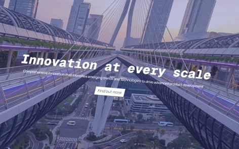
You can customize and change the appearance of your screen saver in the “Experiences” editor page.
Behaviour
Enabled Screen Saver
Select either “Enable” or “Disable“.
When enabled, a screen saver will display after a period of inactivity.
Kiosk Mode
Select either “Enable” or “Disable“.
When enabled, Kiosk Mode ensures that your experience opens with the screensaver every time it is started.
Inactivity Timer
Either type in the number of seconds, or use the up/down arrows to set.
This is the number of seconds of inactivity that occurs before the inactivity pop-up is presented on screen.

Reset Countdown
Either type in the number of seconds, or use the up/down arrows to set.
This is the number of seconds that the inactivity pop-up is displayed before an experience will reset.
Background
Background Media
Click on “Choose background” to open up the media library picker.
To remove the background media, click on the delete icon.
Overlay Color
Click on colored block to open the color picker. You can select a color from your theme or input an alternative color.
This color will appear as an overlay on the media item to provide a contrast for any text, button or logo.
Overlay Opacity
Adjust the slider from left to right.
This will control the opacity of the overlay colour. 0% represents fully transparent, 100% represents fully opaque.
Logo
Logo Visibility
Select either “Enable” or “Disable”.
When “Enable” is selected, your logo will be displayed on the screensaver.
Override Logo
By default, the logo displayed is the one set in the theme.
Click on “Override logo” to open up the media library picker.
To remove the alternative logo, click on the delete icon.
Content
Title
Type in the headline title you’d like to appear on the screensaver. When blank no title will be displayed.
Subtitle
Type in the subtitle you’d like to appear on the screensaver. When blank no subtitle will be displayed.
Text Color
Click on colored block to open the color picker. You can select a color from your theme or input an alternative color.
This color will be used for the title and subtitle.
Vertical Alignment
From the dropdown list select either “Top”, “Center” or “Bottom” to align the text and button accordingly.
The logo – if enabled – will appear in the opposite position.
Horizontal Alignment
From the dropdown list select either “Left”, “Center” or “Right” to align the text and button accordingly.
The logo – if enabled – will appear in the opposite position.
Call-To-Action Button
If “Button” is set to “Enabled”, a button will appear in the center of the screen saver indicating to the user to click on it to enter the experience.
Note: that regardless of whether the button is enabled or disabled, clicking anywhere on the screen saver will enter the experience.
Button Text
Type in the text you’d like to appear on the screen saver call-to-action button.
Button Style
From the dropdown, select either “Primary” or “Secondary” button styles from your theme.