Each experience has its own basket fulfilment form, allowing you to customise the form for each event, meeting or location the experience is used at.
Accessing the Fulfilment Form Settings
Within the admin portal, when you are editing an experience, click on the “Basket” tab to set up your fulfilment basket form.
Default form
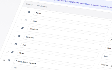
By default, when you create a new experience, the following form setup will be included. You are free to amend, remove or add to as required.
| Enabled | Field Label | Field Type | Settings: Required | Settings: Include in Email | Comment |
|---|---|---|---|---|---|
| True | Name | Text | True | False | |
| True | True | False | The email which the fulfilment basket is sent to. This is a mandatory field which cannot be disabled, deleted or set to unrequired. | ||
| True | Telephone | Phone | False | False | |
| True | Company | Text | False | False | |
| True | Job | Text | False | False | |
| True | Notes | Textarea | False | True | |
| True | Privacy & Data Consent | Info | False | False | Info fields are used to display information only, with no input required from customer. |
| True | [Blank] | Checkbox | True | False | Used to ensure that a user agrees with the privacy and data consent. |
Adding a New Field
To add an additional profile field, click “Add Field” at the bottom of the fields.
Reorder a Field
To reorder the fields as they appear within a fulfilment basket form. Click and hold the four dots at the start of a field row, then move up and down accordingly.
Deleting Fields
To delete a field, click the delete icon at the end of a field row.
When you delete a field, it will be effective for any future baskets and submissions. Any previous submissions will be retained with the original fields when you review the fulfilment submissions.
Understanding the Field Options
Enable
Decide whether or not to show the form field to users
Field Label
The label that will appear above the form field.
Field Type
The following fields types are available
Text
Add a simple text box for users to enter any text.
Phone
Add a predefined phone input field box.
Add a text box for users to enter an email address.
URL
Adds a text field for URLs with no validation
Date
Add a predefined date picker for users to select a date.
Text Area
Add a large text box for users to enter a longer length of text.
Radio
Add a range of definable choices for users to select from. A radio input allows users to tick one option only.
Checkbox
Add a range of definable choices for users to select from. A checkbox input allows users to tick one to many options.
Dropdown
Add a range of definable choices for users to select from. A dropdown input allows users to select one to many options.
Info
The ability to add your own information text on the form (e.g. privacy, rules, disclaimers etc.)
Required
Decide whether or not a user has to provide an answer, or if it’s optional.
If it is required, then the user cannot submit the form without providing an answer.
Include in Email
Decide whether or not the user’s answer will be sent to them in their fulfilment email.
Options for Radio, Checkbox and Dropdown
Radio, checkbox and dropdown field types allow you to add as many options as you wish. You can reorganise and delete these easily.
Add Options
To add options for users to choose from click “Add Option”.
Reorganise Options
To reorder the options as they appear within a fulfilment basket form. Click and hold the four dots at the start of an option row, then move up and down accordingly.
Delete Options
To delete an option, click the delete icon at the end of an option row.