You can easily control the design and layout of all cards within a custom grid.
The following information applies to these components

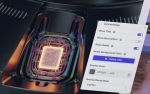
Access the Page Card Settings
- Click on in the top right-hand corner
- Scroll down to Cards
Options
Card Content Position
Determine if the card content bar, containing the Title, Description, and Button, appears at the top or bottom of the card.
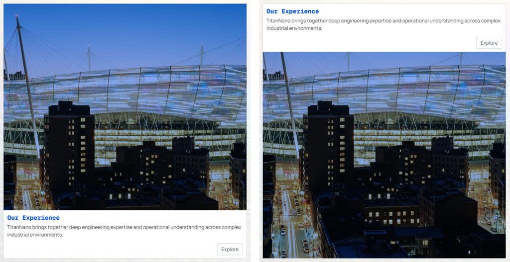
Card Hover States
When on, the card content bar background color only shows on mouse-over. If off, then the bar always shows.
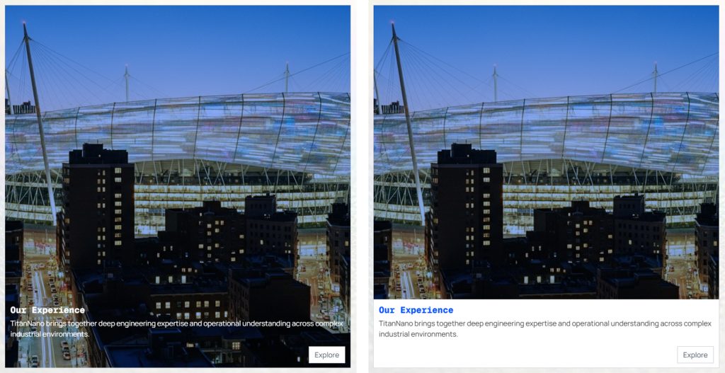
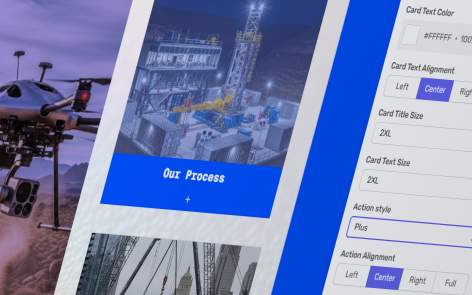
Card Background Color and Card Text Color
Determine the background color and text color of the card content bar, otherwise the colors are determined by the theme.
Click to open the color picker.
Card Title Size and Card Text Size
Use the dropdown to select title and description text sizes for all cards in the grid.
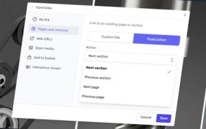
Action Style
If links are added to the cards, then determine the action style that appears on the cards. In all choices, the whole card is clickable, not just the button.
- None – No button appears, but the card remains clickable.
- Button Primary – The primary button from your theme
- Button Secondary – The secondary button from your theme
- Arrow – An arrow symbol is shown
- Plus – A plus symbol is shown
Action Alignment
Determine if the action button appears on the left, center, or right of the card. You can also select “full”, where the button fills the width of the card.
Individual Card Settings
There are additional settings you can apply to each individual card