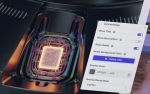
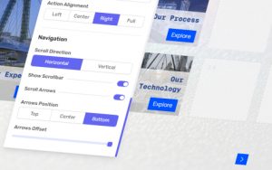
HomeCustom Grid Custom Grid Post categories In Sections & Pages Tags Custom Grid, Page Components The custom grid allows for flexible and creative page layouts, suitable for navigation and menus. Cards Add a Card How-to Guide Custom Grid – Adding Cards Create manual grid cards by dragging across the empty cells to define where a card starts, ends and how much space it takes. Populate a Card How-to Guide Custom Grid – Populating Cards Populate each custom grid card with whatever combination of title, description and media that layout needs, then swap assets later if required. Delete a Card How-to Guide Custom Grid – Deleting Cards Clean up a custom grid by selecting an unwanted card and removing it with that card's own visible delete control. Individual Card Settings Additional Setting Custom Grid – Individual Card Settings Control one custom grid card at a time by toggling its title, description or media and adjusting the card background if needed. Page Card Settings Additional Setting Custom Grid – Page Card Settings Control the house style for every custom grid card at once, from the content bar and hover reveal to button treatment and text size. Grid Settings Grid Direction Additional Setting Custom Grid – Grid Direction Change a custom grid from horizontal to vertical scrolling, or back again, from Page Settings without touching the cards themselves. Grid Size Additional Setting Custom Grid – Grid Size Change how many rows or columns the custom grid uses, depending on its scroll direction, to make the page denser or simpler. Grid Gap Additional Setting Custom Grid – Grid Gap Adjust the spacing between custom grid cards so the whole page feels more compact or more open overall to viewers. Page Settings Page Background Additional Setting Page Backgrounds Layer a page background with colour, image, video or SVG, then position the media and add an overlay where it helps. Page Margins Additional Setting Page Margins Decide whether the page uses one shared margin value or separate spacing on each edge for tighter control across layouts. Scroll Arrows Additional Setting Scroll Arrows Choose whether page scroll cues appear, where they sit vertically and how far they float in from the edge of the screen. Post navigation ←Previous post:Custom Grid – Grid Direction→Next post:Carousels

 POPcomms Help Center