
The following information applies to these components

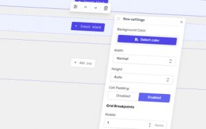
The Layout settings control how the columns within a row are displayed across different screen sizes.
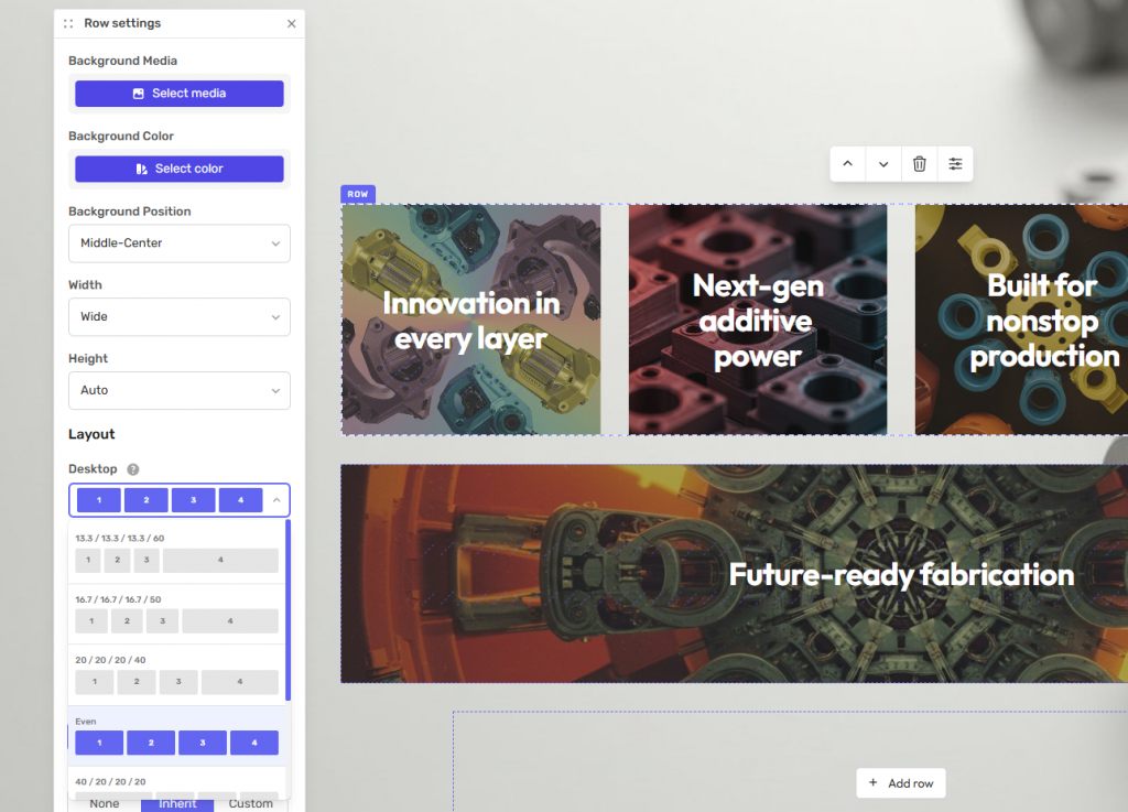
Open the Row Settings and select the Layout tab to configure how the row appears on desktop, tablet and mobile devices.
Desktop Layout
Choose how columns are arranged on desktop screens.
Available options include:
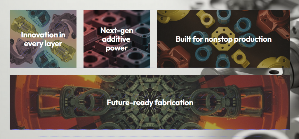
Even – All columns are distributed evenly across the row.
Variable Width – Each column can use a different width, allowing for more flexible layouts.
The available layout options will vary depending on the number of columns in the row.
Tablet and Mobile Layout
After selecting the desktop layout, choose how the row should appear on tablet and mobile devices.
Available options include:
Even – All columns are distributed evenly.
Original – Uses the same layout as the desktop.
Pairs – Displays two columns per row.
Triples – Displays three columns per row.
Stacked – Displays each column on its own row.
This allows you to optimise the layout for different screen sizes while keeping the same content.